Making COTA tell the truth about late buses
In progress · Discover/Define phase (double diamond)An investigation into uncertainty, transparency, and the everyday experience of riding public transit.
The short version
- Problem
- Riders of COTA (Central Ohio Transit Authority) can’t trust the app’s arrival times. Cancellations appear late or not at all, so riders over-plan, wait, and miss buses.
- Role
- Team lead: UX research & prototyping · OSU HCI course
- Timeline
- Sept 2026 to present
- Methods
- Digital log analysis, user interview, empathy mapping, journey mapping, SCAMPER ideation, think-aloud study + Qualtrics survey
- Tools
- Qualtrics, Zoom, Miro, Google Workspace, Figma
The problem
For a rider, an arrival estimate isn’t just a number. It’s the basis for deciding when to leave, where to wait, and whether a backup ride is necessary. When arrivals shift silently and cancellations surface late (or never), that decision becomes a guess, and the wait becomes a gamble.
The paradox: the app holds a 4.6/5 App Store rating, yet riders across Reddit, Facebook, and reviews describe distrust. A strong aggregate rating doesn’t tell the whole story.
Research: listening where riders already complain
As team lead, I shaped the research plan and led a small team through it: digital log analysis across App Store reviews, Facebook, and Reddit, alongside a recorded user interview lasting approximately 28 minutes. We looked for the moments when information stopped helping and started creating uncertainty.
“Every day I have to just guess where the bus is going to decide to pick me up, and pray that I’m right.”
“Second guessing myself and trying to trust this app is driving me crazy.”
“The app and text told me it’d come at 8, and once 8 had passed, the time changed to 8:30.”
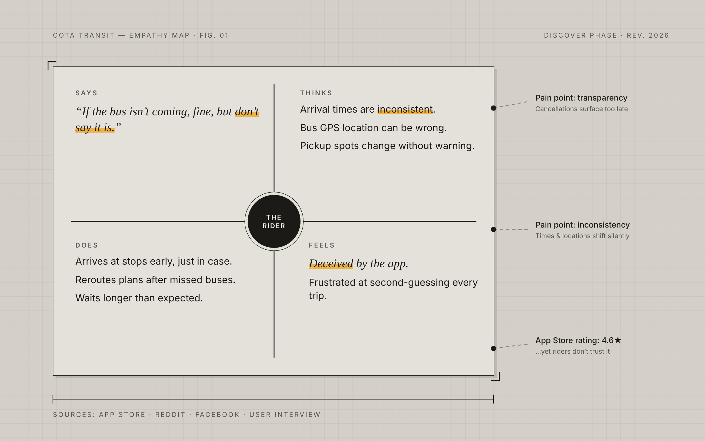
Empathy map
Organizing what riders say, think, do, and feel helped us connect interface issues with the burden of planning a trip.
Says
- “Don’t lie and say it is [coming].”
- “No confirmed cancellations… but I have to assume they are.”
Thinks
- Bus times are inconsistent
- Bus GPS location is inaccurate
- My own location isn’t updating
- Pickup location changes
Does
- Arrives at stops early
- Reroutes plans after missed stops
- Waits longer than expected
- Takes a different bus on the same route
Feels
- Deceived by the app
- Frustrated at second-guessing
- Annoyed at guessing whether the bus will come
Insights
Inconsistency
Times and locations shift without warning, leaving riders to adjust their plans.
Lack of transparency
Cancellations and delays aren’t communicated until it’s too late.
Principles to carry into design
- Reliability: consistency and trust.
- Ease of use: less effort to understand and act.
- Clarity: transparency about what is known and what isn’t.
Ideation
A SCAMPER exercise produced ideas such as a centralized real-time system linking drivers and riders. I narrowed the possibilities to three concepts to explore through research, not validated solutions.
Bus GPS
More accurate tracking with faster alerts and visual indicators when a bus is off schedule or unavailable.
Rescue Buses
A backup bus assigned to finish a disrupted route, with live notifications and ETA.
Live Pings
Opt-in text updates for a selected route and time: distance from your stop, delay ETA, departures, traffic, and availability. Frequency would be adjustable in Notification Center.
Testing the concepts: think-aloud study
We designed the study around low-fidelity verbal prototypes. Participants hear each concept described and think aloud while imagining using it. They then answer Qualtrics questions for each concept: two short-answer questions and four Likert items mapped to trust, reliability, ease of use, and clarity.
“With this feature, I would not feel the need to prepare a backup ride.”
Participants rank the three concepts after reviewing them. Sessions are recorded over Zoom; observations are coded using a Goals / Obstacles / Behaviors / Thoughts / Feelings framework.
- Consent
- Warm-up
- Concept 1
- Concept 2
- Concept 3
- Rank
- Wrap-up
What’s next
Coming soonAnalyze think-aloud and survey data → pick the strongest concept → wireframes → high-fidelity Figma prototype → usability testing.
The project is still in Discover/Define. No final concept or usability outcome is being claimed yet.