Nova ATM
Interface redesign · Course projectAn interface redesign for an everyday interaction that should feel clear, not stressful.
The short version
- Problem
- Traditional ATMs give little feedback, map physical buttons poorly to on-screen options, overload users visually, expose cards to skimming, and exclude many disabled users.
- Role
- UX designer: group project, OSU COMM 3545 (HCI & UX Evaluation)
- Tools
- Figma
- Methods
- Design diary evaluation of 8 products, heuristic evaluation (Nielsen), Norman’s design principles, accessibility review (WCAG 2.1), prototyping, pitch presentation
- Outcome
- A fully designed dual-screen ATM and a clickable prototype covering withdraw, deposit, balance, transfer, cardless mobile withdrawal and error states, presented in a Shark Tank-style pitch.
The problem
The evaluation of traditional ATMs surfaced six core issues: no system feedback after actions; misaligned physical buttons and on-screen options; no clear visual hierarchy, raising cognitive load; full card insertion that creates skimming risk; missing accessibility features; and poor privacy that leaves users exposed to shoulder surfing.
These issues matter because they can create user anxiety and abandoned transactions, exclude large groups of disabled users, and clearly violate Nielsen’s usability heuristics.
Where it started: the design diary
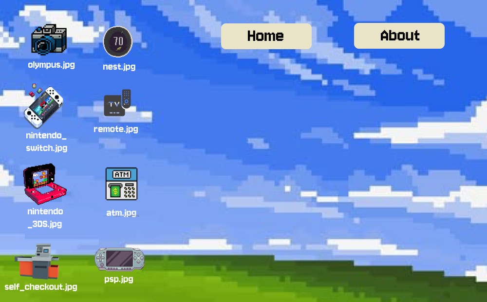
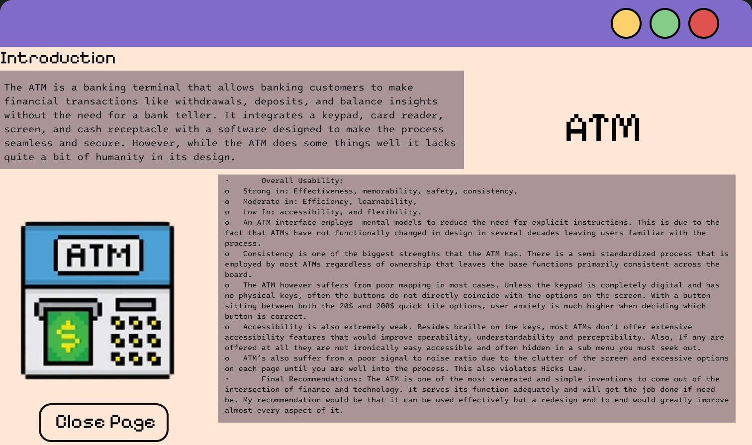
Nova began in our team's design diary, a retro desktop-style site where each product evaluation opens as its own window. We evaluated eight everyday products (including a Nintendo 3DS, PSP, Nest Thermostat, Nintendo Switch OLED, self-checkout kiosk, smart TV remote and Olympus camera) against the UX goals and HCI principles. The ATM evaluation surfaced the clearest problems (weak accessibility, poor mapping and a cluttered screen) and ended with a recommendation to redesign it end to end, so that’s what we did.
What the ATM evaluation found
- Poor mapping — physical buttons sit between on-screen options, so users can't tell which one they're pressing
- Weak accessibility — beyond braille keys, features are few and hidden in sub-menus
- Low signal-to-noise — cluttered screens and too many options early on, violating Hick's Law
- Strengths to keep — strong consistency and familiar mental models across ATMs
Design goals
- Continuous feedback for every action.
- Direct mapping: touch = action.
- A simpler layout with a clear visual hierarchy.
- Error recovery always available, with cancel/back on every screen.
- Recognition over recall, through clear labels and guidance.
- Accessibility built in rather than treated as a separate mode.
Physical redesign
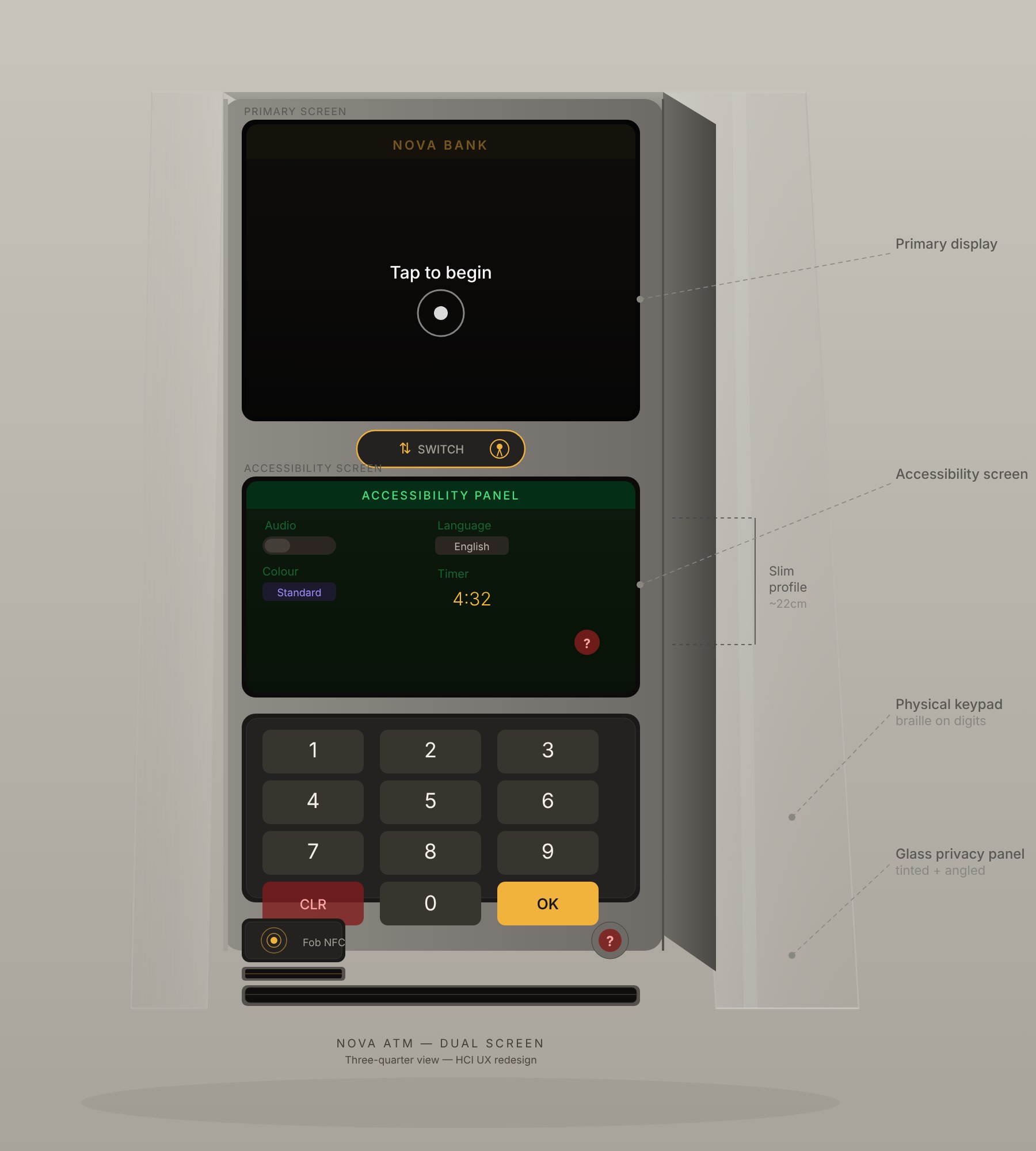
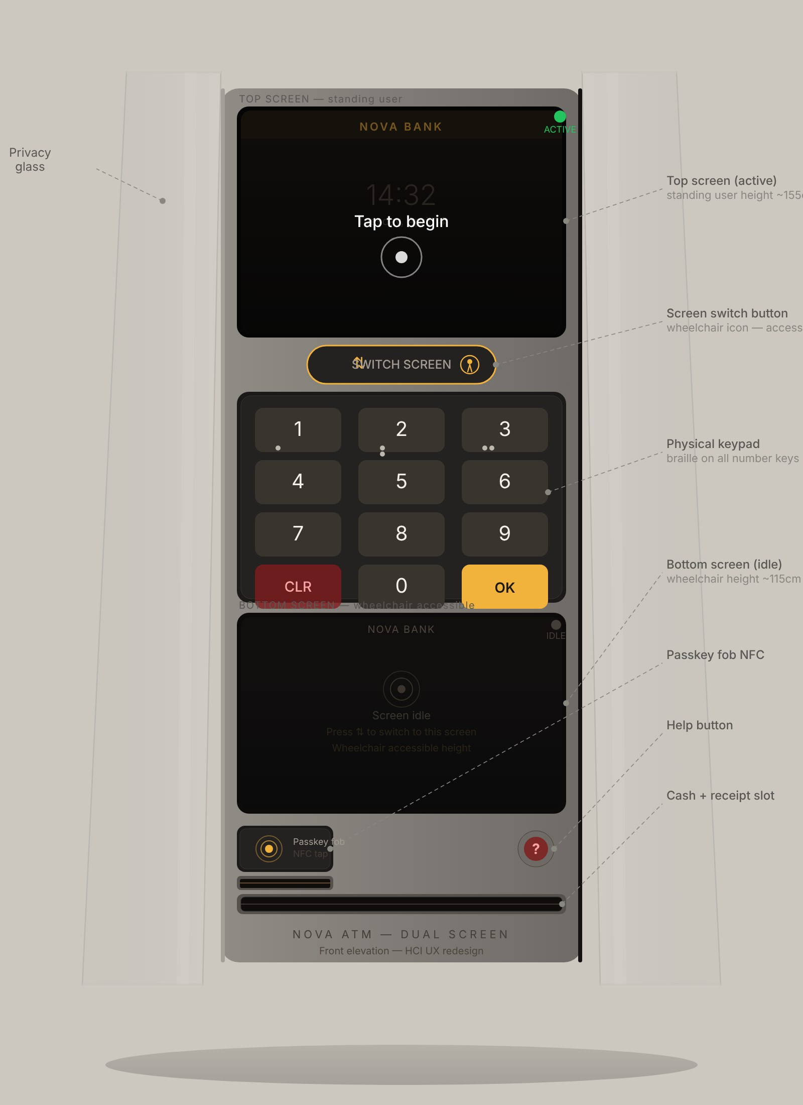
Nova pairs two stacked screens for standing and wheelchair users, with a button to switch between them. Touchscreens replace side buttons, so selecting an option maps directly to the action.
Braille on keypad digits supports tactile input. A dip reader replaces full card insertion, while a passkey fob NFC reader supports cardless access. Tinted, angled privacy glass limits viewing angles to reduce shoulder surfing.
From early UI to prototype
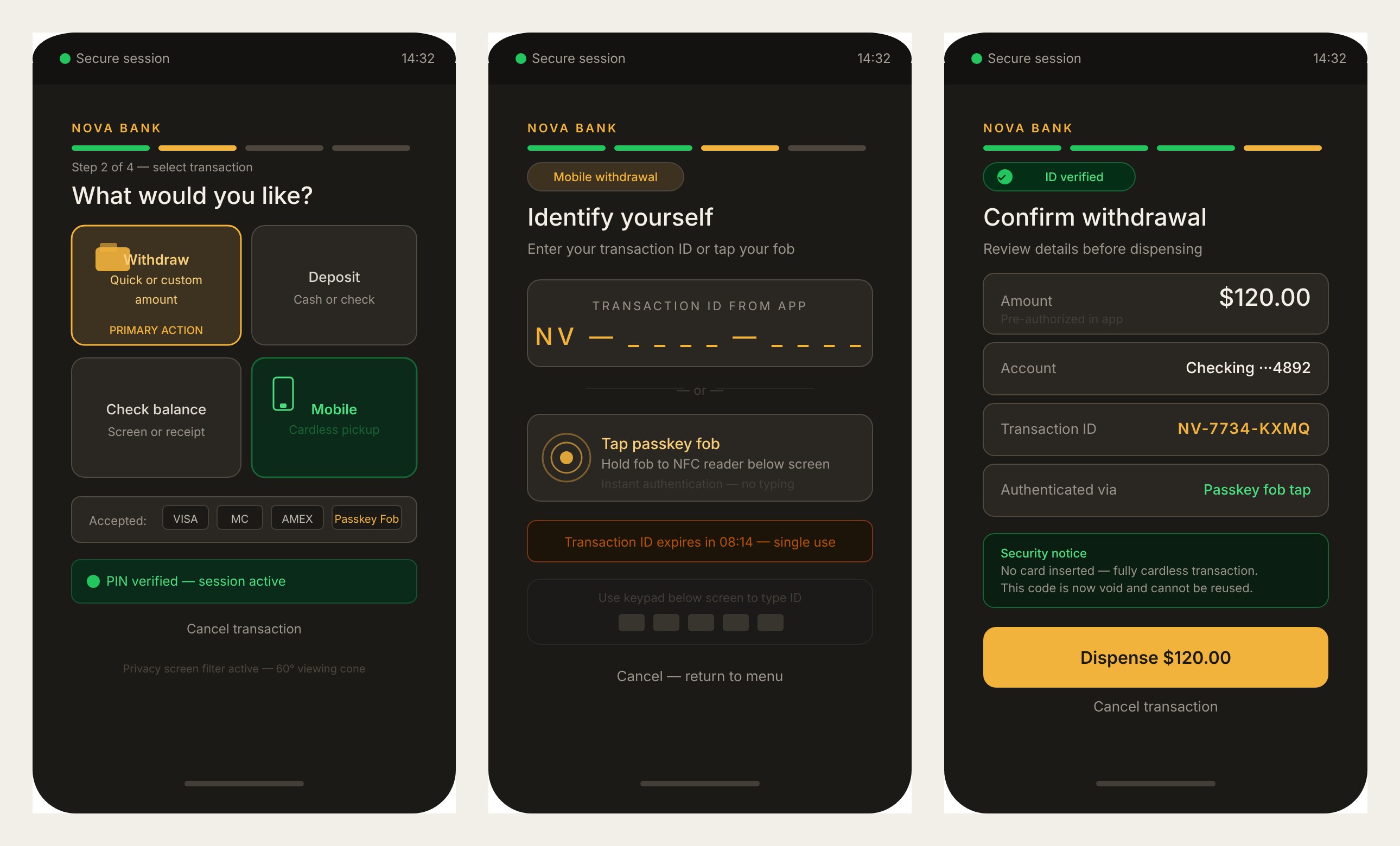
Early design-diary screens explored the transaction menu, cardless mobile ID entry with a single-use code, and a confirmation step. These explorations became the full prototype flows.
Cardless & secure
Withdrawals can be pre-authorized from a phone, then collected using a single-use, time-limited transaction ID or a passkey fob. No card insertion and no PIN are needed for this flow, removing the card-skimmer risk.
Accessibility
Audio guidance, large text mode, and multiple color modes support a wider range of users. Options include deuteranopia, protanopia, tritanopia and high contrast.
The approach is universal design: accessibility is built into Nova, so there is no separate “accessible” ATM.
High-fidelity prototype
Built in Figma, the prototype includes complete flows for withdraw, deposit, balance, transfer and mobile withdrawal, alongside wrong PIN, card locked, system error and session timeout states.
Withdraw
Cardless mobile withdrawal
Deposit
Transfer
Accessibility
Error recovery
High-fidelity screens from the Figma prototype, shown in the refined graphite and marigold palette.
Revisiting the color system
I later reworked Nova's palette. The original navy UI blended in with every other bank screen, and saturated blue is one of the hardest colors to focus on, especially for older eyes, where it can blur against a dark background. I moved the interface to a warm graphite background with a marigold primary color. Marigold on graphite gives high contrast that reads in bright outdoor light, warm darks cut glare, and the familiar dark-screen, bright-button pattern still matches what people expect from an ATM. Green and red stay reserved for success and errors, so status meaning never changes. The cabinet moved from blue-black to a neutral brushed graphite with smoke-tinted privacy glass so the hardware recedes and the screen leads.
- Graphite#1C1A17Background
- Surface#2A2723Cards
- Marigold#F2B33DPrimary actions
- Warm white#F4F0E8Text
Defending the design
The team presented Nova in a Shark Tank-style pitch, mapping each decision back to Nielsen’s heuristics, Norman’s principles, WCAG 2.1 and ISO usability guidelines. Every choice in hierarchy, layout and flow had to be justified.
Reflection
- Designing hardware and software together changes what “usability” means.
- Accessibility works best as the default rather than a mode.
- A next step would be usability testing with real ATM users, including wheelchair users and older adults, to validate the design.